[ PROJECT INFO ]
the elevator pitch

[ THE BRIEFING ]
Coinchu is a classroom economy: kids earn a salary, pay rent, and save up, learning money by living it. Strong idea, shaky product. It had shipped before it was ready, and the brief that reached me was one line: make it prettier. The real problem wasn't the paint. It was the first run. 20 signups, 0 active, and a first run that lost people at the door. So I rebuilt the strategy underneath, redrew all 24 screens, and swapped a PDF onboarding manual for a guided first run that walks a teacher in. The founders tested it across two focus groups. It landed well enough that they asked me back for round two.
DESIGN
PM
UX / UI
RESEARCH
Nº
01
CLIENT
COINCHU
TYPE
0→1 EDTECH · RESCUE
STATUS
DELIVERED ✔ · REHIRED
[ PROJECT SUMMARY ]
Ownership
90% end-to-end
Timeline
9 weeks · 2 phases
Platform
Web · tablet-first
Tools
Figma · WCAG
Client type
Bootstrapped edtech
[ THE MISSION ]


✦
DISCLAIMER
Coinchu is a portfolio pseudonym. Names, copy, data and selected visual assets have been modified to protect client confidentiality, while the design process, decisions and my role remain accurately represented.
[ THE SETUP ]

Coinchu turns a classroom into a working economy. Kids earn a salary from class jobs, pay rent on their desks, buy privileges, and save toward "retirement" by the last day of the year. It teaches money by making them live in it.
The concept was already proven in a real classroom. The product wrapped around it was not. Two people had ever really used it:
one power user who gave back almost no signal, and
the co-founder, who still relearned the core screen every time she logged in.
And the brief? A whisper. No product brief, no design brief, no brand brief. One live site and one sentence of direction. The founders were bootstrapped teachers, so the stakes were personal, and the clock was real: land in classrooms this season, or not at all.
No documented Point A
First-run failure
20 signups → 0 active
Ship this season or never
[ THE MOVE ]

If the brief had a soundtrack, it was "Sit Still, Look Pretty." Great song, wrong strategy for a product that was losing users. So I widened it. I reconstructed the missing Point A from fragments: a SWOT, plus the brand, product and design briefs nobody had written yet. Then a tiered teardown of four competitors, on live accounts. Every decision traces back to something the founders said or something I found. Nothing shipped just because it looked good.
✦
THE FINDING THAT ANCHORED EVERYTHING
I mapped every competitor's brand and CTA colours. The whole category was crowding into the same few shades, chasing each other into a corner. One lane sat wide open, so Coinchu took it. The colour that set us apart turned out to be the most native thing on the table, not a costume.
The client asked for cards. I shipped a list. Here's why.
The request was to turn the student roster into cards, so a teacher could see the whole class at once. The easy moves were to cave or to dig in. I did neither. The roster stays a list, because a list wins on density, sorting and select-all, with a density toggle to compress a full class when you need it. The real "see everyone at once" job got its own home: a projector-ready Present Mode. Match the pattern to the task, not to the loudest voice in the room.

A decision doc I built into the handoff
Every screen, component and brand call shipped with four layers of notes, so nothing had to be reverse-engineered later.
UX notes: the interaction logic and the edge cases, written for whoever builds it.
Dev notes: states, breakpoints and specs, so engineering never has to guess.
Strategic notes: how each choice ties back to the product goal and the research.
Reasoning notes: why this option won over the ones I tried and dropped.
[ THE TWIST ]

The handoff was solid. What made it land was going one step past the brief and building a little delight for the client, not just the users. Good work gets delivered. Delightful work gets talked about.
✦
THE EASTER EGG
The auth-screen avatars were secretly styled after the real founding team, reference photo beside the render. Delight had to reach the client too. They were floored.
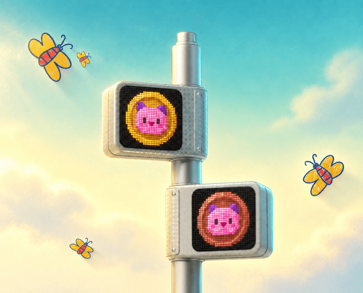
A currency mark I invented
Drawn to pass WCAG at small sizes, and to keep real money and classroom money from ever looking alike.

Present Mode + a live action bar.
Pay, attendance, timer, randomizer: the moves a teacher makes mid-class, one tap away instead of buried in a menu.
[ THE PAYOFF ]

It hadn't launched by handoff, so there are no retention curves to wave around. Honestly? Good. I'd rather show you what shipped and why each piece holds up.
%
less first-run friction
+
dev-ready screens
+
competitor teardowns
AA
WCAG 2.1 passed
None of these are vanity numbers. The onboarding one is the one I'd underline: the first run went from a PDF manual to an in-product walkthrough, which cut the friction to a first successful session by roughly 95%. The rest add up to a full audit, a system that holds, and a brief I reframed with evidence behind every move. The signal I trust most, though, isn't on a tile.
"For the first time, it looks like what we imagined when we started, and you got there without watering down the product to do it."
THE FOUNDER · after two rounds of user focus groups
That feedback came after the focus groups, not on a first look. They circulated the handoff across their team, then came back to rehire me for round two. A kind quote is easy to give; a rehire is a decision, and it's the one that compounds.
[ FAQs ]
[ THE TIMELINE ]

[ ESTABLISH CONNECTION ]

Like how I think?
This is one entry in the dex. If turning a fuzzy brief into a shipped, evidence-backed product is the kind of hire you're after, in-house or freelance, I'd love to talk.